Graphs and charts are an essential tool for visualizing data, and with SwiftUI, it’s easy to create custom and interactive graphs (Spoiler: we won’t add any interactivity during this arcticle). You can use them in iOS, iPadOS, and macOS apps. In this article, we’ll explore how to draw a line graph in SwiftUI. In a follow up article I will show you how to draw bar graphs in SwiftUI.
See my earlier article if you want to draw graphs in Swift: https://mic.st/blog/draw-graphs-easily-with-carekits-ockcartesianchartview/
Let’s start with a really quick recap as you might still be pretty new to SwiftUI.
Update: Native API for iOS 16.0+
The following article is about building a view for showing graphs on your own.
There is also Apple’s own native framework for drawing graphs in SwiftUI that you can use starting iOS 16.0+.
If possible, you should use this native API, see: https://developer.apple.com/documentation/charts
Thanks @Jem for leaving a comment about that!
SwiftUI project Setup
Let’s take a quick moment to recap on SwiftUI. As you may know, SwiftUI is a modern UI framework that uses a declarative syntax to create user interfaces. For starters, it has way less boilerplate compared to defining UIs or views in general using Swift alone. However, the syntax can look a little strange if you are coming from Swift.
To create a new SwiftUI project, launch Xcode and select “File” > “New” > “Project.” In the “Create a new Xcode project” window, select “App” and click “Next.” Then, choose “SwiftUI” as the user interface and give your project a name. Finally, select the directory where you want to save your project and click “Create.”
Alright, now we are ready to go! You should see a new Xcode project where you land in a file called “ContentView.swift”. On the right side there should be your preview of this rendered ContentView.
The classic “Hello, World!” content looks like this:
struct ContentView: View {
    var body: some View {
        VStack {
            Image(systemName: "globe")
                .imageScale(.large)
                .foregroundColor(.accentColor)
            Text("Hello, world!")
        }
        .padding()
    }
}

struct ContentView_Previews: PreviewProvider {
    static var previews: some View {
        ContentView()
    }
}Code language: Swift (swift)
If you never did any SwiftUI before, I can highly recommend to just play a little bit around with this piece of code. Just add any view modifiers and see what happens.
Draw a Line Graph in SwiftUI
Now that we have our little project set up, let’s start by draw the line graph itself. As you probably know, a line graph is a simple type of graph that displays data as a series of points connected by straight lines. We could later add some rounding / interpolating to make it look “nicer” but let’s start easy first.
Our goal is to pass some data that represents X and Y coordinates to some custom View and this View should render our data. To make things easier, the view should scale itself accordingly to the minimum and maximum values. The origin of the graph should be at the bottom-left corner.
E.g. the data might look like this:
let data:[(Double, Double)] = [(0, 0), (1, 5), (2, 3), (3, 8), (4, 4), (5, 6), (6, 1)]Code language: Swift (swift)This data set represents seven points with the x-values ranging from 0 to 6 and the y-values ranging from 0 to 8.
In the following sections I will start with the code followed by a small explanation what happens. The great thing about SwiftUI is that you can quickly play around with it. That means whenever you need to re-draw your line graph in SwiftUI you do not need to re-build. Xcode does instantly render your view in the preview.
Eventually we want to have a custom View that we can call like this:
import SwiftUI

struct ContentView: View {
  let data:[(Double, Double)] = [(0, 0), (1, 5), (2, 3), (3, 8), (4, 4), (5, 6), (6, 1)]

  var body: some View {
    LineGraphView(data: data)
  }
}

struct ContentView_Previews: PreviewProvider {
  static var previews: some View {
    ContentView()
  }
}Code language: Swift (swift)
Drawing the data
Let’s start with the code for drawing the line itself.
struct LineGraphView: View {
let data: [(Double, Double)]
var body: some View {
GeometryReader { geometry in
Path { path in
let xScale = geometry.size.width / CGFloat(data.count - 1)
let yScale = geometry.size.height / CGFloat(data.max { $0.1 < $1.1 }?.1 ?? 1)
path.move(to: .init(x: 0, y: geometry.size.height - CGFloat(data[0].1) * yScale))
for i in 1..<data.count {
path.addLine(to: .init(x: CGFloat(i) * xScale, y: geometry.size.height - CGFloat(data[i].1) * yScale))
}
}
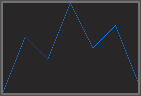
.stroke(Color.blue, lineWidth: 2)
}
}
}Code language: Swift (swift)Alright, let’s break down this code snippet! We start with a GeometryReader, which gives us access to the size of the view it’s contained in.
If you want to learn a little bit more about `GeometryReader`https://www.hackingwithswift.com/books/ios-swiftui/understanding-frames-and-coordinates-inside-geometryreader by Paul Hudson.
Next, we create a Path and start drawing the line using move(to:) to move the drawing cursor to the first point of our data. Then, we loop through the data and draw a line to each subsequent point using addLine(to:).
We calculate the scaling factors for the x and y axes by dividing the view size by the number of data points and the maximum data value, respectively. Finally, we stroke the path with a blue color and a line width of 2 points. And voila, we have ourselves a beautiful line graph!
Axis and ticks
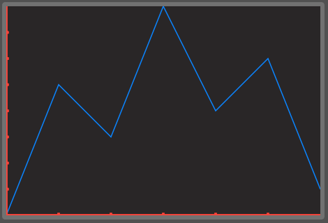
However, what is not so beautiful are the missing axis and ticks on the axis to indicate the data point values. To draw the line graph in SwiftUI was rather easy. Adding ticks involves some more thinking for making it perfect. For simplicity we just want to have a tick for every full value. In the conclusion section there is an example showing that this does not always works really great.
Add the following code into you GeometryReader block for adding axis and ticks.
// x-axis
Path { path in
  let xScale = geometry.size.width / CGFloat(data.count - 1)
  let y = geometry.size.height
  path.move(to: .init(x: 0, y: y))
  path.addLine(to: .init(x: geometry.size.width, y: y))

  let tickSpacing = 1
  for i in 0..<(data.count - 1) {
    let tickX = CGFloat(i * tickSpacing) * xScale
    guard tickX < geometry.size.width else { break }
    path.move(to: .init(x: tickX, y: y - 5))
    path.addLine(to: .init(x: tickX, y: y + 5))
  }
}
.stroke(Color.red, lineWidth: 5)

// y-axis
Path { path in
  let x: CGFloat = 0
  let yScale: CGFloat = geometry.size.height / CGFloat(data.max { $0.1 < $1.1 }?.1 ?? 1)
  path.move(to: .init(x: x, y: 0))
  path.addLine(to: .init(x: x, y: geometry.size.height))

  let tickSpacing: CGFloat = 1
  for i in 0..<Int(data.max { $0.1 < $1.1 }!.1) {
    let tickY = CGFloat(i) * tickSpacing * yScale
    path.move(to: .init(x: x - 5, y: geometry.size.height - tickY))
    path.addLine(to: .init(x: x + 5, y: geometry.size.height - tickY))
  }
}
.stroke(Color.red, lineWidth: 5)Code language: Swift (swift)
OK, what happens here?
The first block of code creates the x-axis. It starts by defining a Path and then setting the starting point at the bottom-left corner of the chart. The x-axis is drawn using the addLine method, which creates a line from the starting point to the right-most point of the chart. The tickSpacing variable is used to determine the space between each tick on the x-axis. The loop iterates over the data set. Inside of it we draws tick marks at the specified intervals along the X-axis.
The second block of code creates the y-axis. It looks quite similar to the first one. However, for calculating the yScale we need to find the maximum Y value of the data set.
Finally, both the x and y axis are drawn using the stroke method. This uses the specified color and line width for drawing the path.
For our simple example, we chose a fixed tickSpacing value of 1 so that you can easily read our small number of data points. You might need to change this logic if you want to render larger data sets.
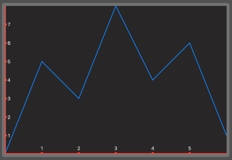
Add some labels
Still our graph looks a little bit empty.You do not really get an idea of the dimensions. So let’s add some labels on our ticks. For simplicity, we just add on every tick a label of the tick’s value. Depending on your expected data you might change the logic here a little bit as well.
You can add the following code also inside of your GeometryReader
// add x-axis tick labels
ForEach(1..<(data.count - 1), id: \.self) { i in
  let tickLabel = Text("\(i)")
    .frame(width: 16, height: 16, alignment: .center)
  let tickX = CGFloat(i) * geometry.size.width / CGFloat(data.count - 1)
  tickLabel
    .position(x: tickX, y: geometry.size.height - 16)
}

// add y-axis tick labels
ForEach(1..<Int(data.max { $0.1 < $1.1 }!.1), id: \.self) { i in
  let tickLabel = Text("\(i)")
    .frame(width: 16, height: 16, alignment: .center)
  let tickY = CGFloat(i) * geometry.size.height / CGFloat(data.max { $0.1 < $1.1 }!.1)
  tickLabel
    .position(x: 16 - 5, y: geometry.size.height - tickY)
}Code language: Swift (swift)
We basically loop over the same ranges we had before. I did set the label’s frame to a fixed size so that their position is easier to calculate.
Conclusion
We did just draw a simple line graph in SwiftUI by using a relatively simple custom view. This handles scaling and adding of axis, ticks and labels completely on it’s own. If you add more data than the example of just seven values it will automatically scale itself.
From this solution you can easily iterate now. E.g. add support for larger datasets, add animations, more labels, legends, lines, animations, etc.
First thing you will quickly see, is that the given first draft will not look that great for large data sets.
For example given this data:
struct ContentView: View {
  let data:[(Double, Double)] = [(0, 0), (1, 5), (2, 3), (3, 30), (4, 4), (5, 6), (6, 1), (7, 4), (8, 6), (9, 1)]

  var body: some View {
    LineGraphView(data: data)
  }
}Code language: Swift (swift)
You get the following output:
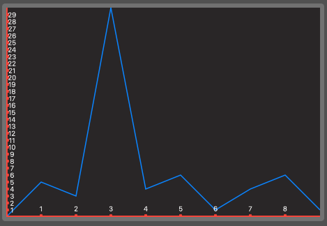
As you can see, what I mentioned earlier comes into effect here: Because we did just add ticks and labels for every value, the Y axis looks a little bit crowded. You can fix this by adding an additional parameter (e.g. for removing every n-th tick) or you change the logic so that it automatically hides some based on your needs (e.g. based on the view’s available size).
However, I will leave that up to you now 🙂 Happy experimenting!
Full Code example
ContentView.swift
//
//  ContentView.swift
//  TestGraph
//
//  Created by Michael Steudter on 01.05.23.
//

import SwiftUI

struct ContentView: View {
  let data:[(Double, Double)] = [(0, 0), (1, 5), (2, 3), (3, 30), (4, 4), (5, 6), (6, 1), (7, 4), (8, 6), (9, 1)]

  var body: some View {
    LineGraphView(data: data)
  }
}

struct ContentView_Previews: PreviewProvider {
  static var previews: some View {
    ContentView()
  }
}
Code language: Swift (swift)
LineGraphView.swift
//
//  LineGraphView.swift
//  TestGraph
//
//  Created by Michael Steudter on 01.05.23.
//

import SwiftUI

struct LineGraphView: View {
  let data: [(Double, Double)]

  var body: some View {
    ZStack {
      GeometryReader { geometry in
        Path { path in
          let xScale = geometry.size.width / CGFloat(data.count - 1)
          let yScale = geometry.size.height / CGFloat(data.max { $0.1 < $1.1 }?.1 ?? 1)
          path.move(to: .init(x: 0, y: geometry.size.height - CGFloat(data[0].1) * yScale))
          for i in 1..<data.count {
            path.addLine(to: .init(x: CGFloat(i) * xScale, y: geometry.size.height - CGFloat(data[i].1) * yScale))
          }
        }
        .stroke(Color.blue, lineWidth: 2)

        //				// x-axis
        Path { path in
          let xScale = geometry.size.width / CGFloat(data.count - 1)
          let y = geometry.size.height
          path.move(to: .init(x: 0, y: y))
          path.addLine(to: .init(x: geometry.size.width, y: y))

          let tickSpacing = 1
          for i in 0..<(data.count - 1) {
            let tickX = CGFloat(i * tickSpacing) * xScale
            guard tickX < geometry.size.width else { break }
            path.move(to: .init(x: tickX, y: y - 5))
            path.addLine(to: .init(x: tickX, y: y + 5))
          }
        }
        .stroke(Color.red, lineWidth: 5)
        //
        // y-axis
        Path { path in
          let x: CGFloat = 0
          let yScale: CGFloat = geometry.size.height / CGFloat(data.max { $0.1 < $1.1 }?.1 ?? 1)
          path.move(to: .init(x: x, y: 0))
          path.addLine(to: .init(x: x, y: geometry.size.height))

          let tickSpacing: CGFloat = 1
          for i in 0..<Int(data.max { $0.1 < $1.1 }!.1) {
            let tickY = CGFloat(i) * tickSpacing * yScale
            path.move(to: .init(x: x - 5, y: geometry.size.height - tickY))
            path.addLine(to: .init(x: x + 5, y: geometry.size.height - tickY))
          }
        }
        .stroke(Color.red, lineWidth: 5)

        // add x-axis tick labels
        ForEach(1..<(data.count - 1), id: \.self) { i in
          let tickLabel = Text("\(i)")
            .frame(width: 16, height: 16, alignment: .center)
          let tickX = CGFloat(i) * geometry.size.width / CGFloat(data.count - 1)
          tickLabel
            .position(x: tickX, y: geometry.size.height - 16)
        }

        // add y-axis tick labels
        ForEach(1..<Int(data.max { $0.1 < $1.1 }!.1), id: \.self) { i in
          let tickLabel = Text("\(i)")
            .frame(width: 16, height: 16, alignment: .center)
          let tickY = CGFloat(i) * geometry.size.height / CGFloat(data.max { $0.1 < $1.1 }!.1)
          tickLabel
            .position(x: 16 - 5, y: geometry.size.height - tickY)
        }
      }
    }
  }
}
Code language: Swift (swift)
2 replies on “Draw line graphs and charts in SwiftUI”
Why did you roll your own chart when there is a perfectly good native Charts framework created by Apple months prior to this post? Wouldn’t you want to teach the reader the most efficient way to do it?
Hey Jem,
thank you for the hint and sorry for my late reply!
Of course you are right, I just updated the article with a link to the official docs.
Back then my project on that I based the article was not min 16.0 so I was not able to use it and did not really look into it.
But yes, whenever possible you should always prefer native APIs. Thanks again for the hint!
Have a nice day and best regards,
Michael