On February, 2nd there was the US release of Apple’s Vision Pro which started (according to Apple) the era of “spatial computing”. In case you are not a US citizen or flew to the US just for getting your hands on a device, you might ask yourself: Can I even develop or release an app for platform like visionOS without testing on a real device?
Let me tell you: Yes you can! And in fact that is what I did.
Some weeks after Xcode’s first beta release with their Vision Pro simulator came out I started building some stuff. Initially, I thought now I have to learn using 3D objects somehow together with Xcode, learn shaders or even Unity.
Luckily that is not the case. You can start really simple. I always wanted to create a “music app” and BeatFabrik is what I came up with, here is the link to the AppStore: https://apps.apple.com/us/app/make-music-with-beatfabrik/id6475737516?mt=8
It’s basically a really simple digital audio workstation (DAW). Everything is based on AudioKit which is one of my most favorite 3rd party SDKs. It is in a 2D environment but with some touches it feels more native to visionOS (as far as I can tell from the simulator of course)
SwiftUI for visionOS
To quickly start developing for visionOS you do not really have learn a whole new language or way of developing. You can start really simple by using SwiftUI and adding some “spatial touches” to it.
This was also the plan for my first ever visionOS app BeatFabrik and in the following chapters I will give you some very basic new features you can use to make your 2D app look more native to visionOS.
A very basic visionOS app
To start simple you do not have to create stunning 3D graphics or anything, basically you can just fire up Xcode and start a clean project for Vision Pro.

This very first template project already shows a 3D object (a sphere) that changes it’s size based on a button press.
What is recommended also by Apple somewhere is to start simple maybe even just run an existing app and add some “key moments” inside of your app, e.g. something that is only possible in visionOS. It does not have to be fireworks or immersion and stuff right from the beginning. Just something simple like elevated elements, using materials that let light shine through etc. are enough as a first step.
Let’s start!
Adding glass material aka glassBackgroundEffect()
One of the easiest things you can do for optimizing your app for visionOS is using the glass background material. Just using this, makes your app instantly feel more home. There is a new modifier called .glassBackgroundEffect()that you can just add to any view. What it does is giving your view a subtile glassy background effect. You can also stack these if you want of course.
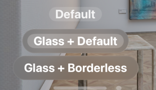
The glass background effect also works nicely with buttons. However, to make it look right, what I think looks best is using a border-less style and an increased the font size. In fact, you will often need to increase font sizes to make it look right. There are even two new font sizes called extraLargeTitle and extraLargeTitle2 specifically for visionOS. The following screenshot shows three differently built buttons:

The first is just a plain Button with some .padding() and increased font size. This works when there is a background but often it is probably a little too subtle.
When just adding .glassBackgroundEffect() you get this kind of double border you see on the second button. What we really want is the third one. Having a button with a single rounded glass background.
This is the code for all three variants:
Button {
	print("hello")
} label: {
	Text("Default")
		.font(.extraLargeTitle2)
}
.padding()

Button {
	print("hello")
} label: {
	Text("Glass + Default")
		.font(.extraLargeTitle2)
}
.padding()
.glassBackgroundEffect()

Button {
	print("hello")
} label: {
	Text("Glass + Borderless")
		.font(.extraLargeTitle2)
}
.padding()
.buttonStyle(.borderless)
.glassBackgroundEffect()
Code language: Swift (swift)
Stacking glass backgrounds
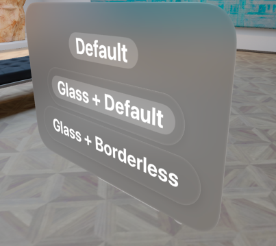
When putting some background behind your buttons you see how the glass background reacts to its environment. It casts a fine shadow onto anything below it and it appears to be slightly elevated.

It’s not only the shadow though and the docs mention all the effects automatically applied when using the glass background. It’s a lot and luckily everything is accessible via this simple modifier:
Use this modifier to add a 3D glass background material that includes thickness, specularity, glass blur, shadows, and other effects. Because of its physical depth, the glass background influences z-axis layout.
Source: https://developer.apple.com/documentation/SwiftUI/View/glassBackgroundEffect(displayMode:)
I just added everything to a VStack with another .glassBackgroundEffect(). As you see now, it’s more of the opposite. So the default button looks way more prominent than the border-less one with glassBackgroundEffect. Also keep in mind that there is a subtle “hover effect” whenever the button is focussed. So, actually the button kind of becomes prominent as soon as it’s looked at.
Ornaments
Adding ornaments is also a simple and effective way of making your plain user interface slightly more interesting. Eventually, you get kind of containers that you can place around your main interface. You can use one of the available anchor point or pass completely custom unit points. E.g. .scene(.bottom) will add an ornament to the bottom center of your scene. Using these named anchors is most probably the preferred and also easiest way.
Wherever your ornament is placed, the containing view will appear slightly elevated and offset from the view this modifier is used on.
Here is a screenshot from my other article (https://mic.st/blog/swiftui-ornaments-modifier-for-visionos-app-on-vision-pro/) about ornaments:

Text and a Button.In my other article there is a code example. You can put anything inside the ornaments but you should not use it as a replacement for modals or something. Apple’s Human Interface Guidelines (HIG) mention some best practices or use cases: https://developer.apple.com/design/human-interface-guidelines/ornaments/
Playing with depth
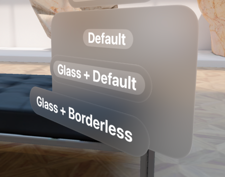
The .frame() modifier got a new variant featuring a depth parameter. Using this on a view, you can place it also freely on the Z-axis.

Button {
	print("hello")
} label: {
	Text("Glass + Borderless")
		.font(.extraLargeTitle2)
}
.padding()
.buttonStyle(.borderless)
.glassBackgroundEffect()
.offset(.init(width: 0, height: 120))
Code language: Swift (swift)
Animating depth
Of course you can also animate depth values if you want similar to how you can animate basically any other value in SwiftUI as well.
Here is a small example of it:
However, you really should not overdo it as it easily distracts users. It might be beneficial for pointing towards something important but you definitely should not have a lot of buttons jumping around in your UI.
You can achieve the effect above using a simple easeInOut animation:
@State private var depth = 1.0

/// inside of
var body: some View {
	SomeView()
		.glassBackgroundEffect()
		.frame(depth: depth)
		.animation(Animation.easeInOut(duration: 1).repeatForever(), value: depth)
		.onAppear {
			self.depth = 100
		}
}
Code language: Swift (swift)
Conclusion
With some simple to use new additions to SwiftUI you can make your simple 2D views look nicely and more “feeling home” when it comes to visionOS. All of this will hopefully help you developing and releasing your first visionOS app!
However, as mentioned above, keep usability and accessibility in mind and do not overdo it. It is always best to start looking into Apple’s HIG for getting some inspirations and best practices. Especially for such a new platform.
Happy coding!